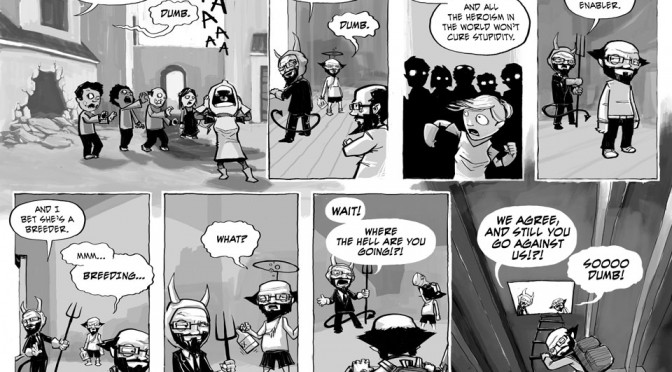
It’s kinda funny… In an effort to speed up my page production, I decided to simplify the art a bit. Unfortunately, as always, when I started messing with the art direction, I kept messing with it. In this particular page, I did away with all the detail of the previous page, hoping to simplify the character designs, thus decreasing the amount of time spent drawing. Then I decided I wanted to paint the backgrounds…
It seemed like a good idea at the time.
Unsurprisingly, I ended up spending more time testing out methods of digital painting, and more time messing with options for rendering things, thus losing any advantage gained by simplifying the drawing process. OH WELL. Expect things to continue to evolve, and thank you for your patience.

I get the whole “simplfying the art” bit, and the strip looks great, but your detail has always been one of my favourite things about your art, Jim. Still, evolution is all about seeing what works and what doesn’t – if it can’t adapt, it doesn’t prosper.
And what is the point of having a conscience if you can’t ignore it (them?) every now and then. ^^;
I love this new style. It evokes a sense of scale. That scale being miniature. I get this feeling that your characters are in a tiny, stop-motion sort of world. It’s very charming. I heartily approve.
@Doug: Don’t worry Doug, I’m pretty compulsive regarding detail, so that’s always going to creep in there.
@addam: Thanks!